
YouTube | The much-needed redesign
Role & Scope
Role: UX/UI Designer, UX Researcher, Concept Creator, End-to-End designer
Scope: Visual redesign, interaction improvements, layout restructuring
Tools: Figma / Adobe XD
Outcome: A polished demonstration of UI strategy and visual direction
Timeline: November 2024 - January 2025
Redesigning YouTube’s UI to enhance user friendliness
YouTube’s interface can overwhelm users with cluttered information, inconsistent controls, and hidden features. This concept project reimagines YouTube’s interface from the ground up, rethinking how users interact with core features, how content surfaces, and how visual hierarchy can support faster exploration and better clarity. The redesign is inspired by the idea of simplifying complex interactions while preserving YouTube’s identity and content richness.
Objectives
Enhance Usability: Streamline the interface to make navigation more intuitive and reduce cognitive load
Improve Accessibility: Ensure that the design optimally enhances readability and contrast for users with visual impairments
Optimize Content Discovery: Redesign the home feed, search results, and video player interface to facilitate seamless content exploration
Refine Visual Hierarchy: Improve typography, spacing, and button placements to create a more organized and engaging viewing experience
Ensure Consistency: Establish a cohesive design system with consistent UI components and interactions
Research
Although this is a concept redesign, it draws on broader commentary about user sentiment toward recent interface updates and common friction points around controls and visual clutter. Real-world reactions to recent YouTube redesigns indicate confusion and a desire for clarity in navigation and interactions.
User Surveys: Conducted with frequent YouTube users to identify pain points in the existing interface.
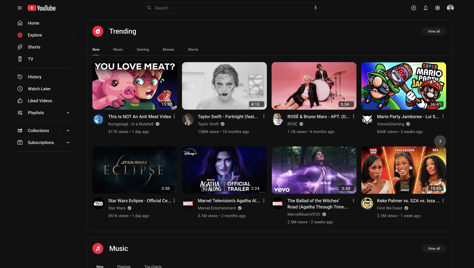
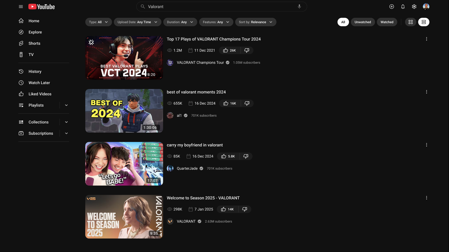
Competitor Analysis: Studied UI/UX patterns from streaming and content platforms like Netflix, Twitch, and Vimeo.
A/B Testing: Evaluated different UI layouts and interactions to determine the most user-friendly approach.
Accessibility Audits: Assessed the contrast ratios, text readability, and ease of navigation for visually impaired users.
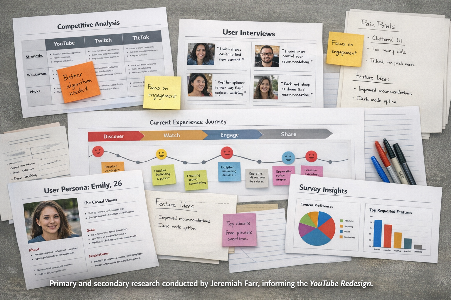
User insights include:
Redesigns often feel jarring and disrupt user habits
Users want controls that don’t obscure content
Threaded comments and navigation simplicity are valued changes
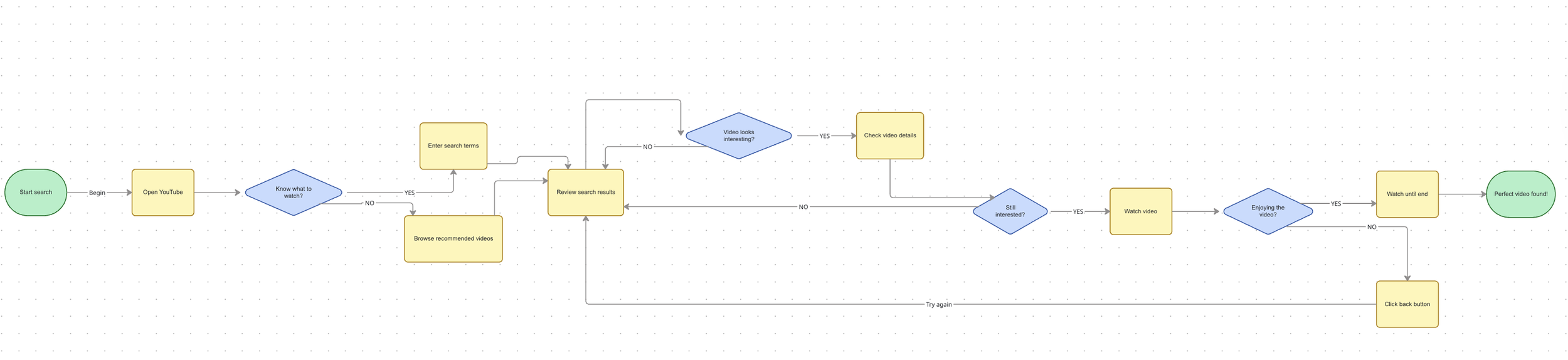
YouTube UX Flow (Core User Journey)
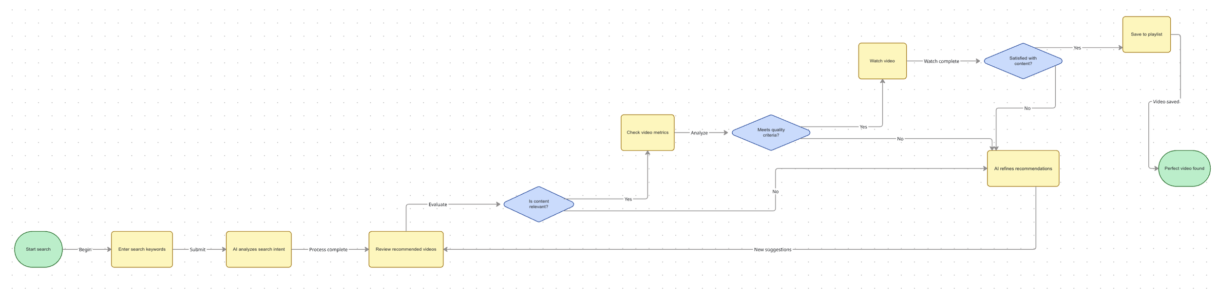
YouTube UX Flow (AI Integration)
My Approach
I began with experience framing, defining what problems a fresh UI should solve and what behaviors it should support. This informed early sketches and modular layout experiments. From there I moved into high-fidelity mockups focusing on:
Streamlined bottom navigation
Cleaner video player controls
Simplified feeds with clear visual tiers
Enhanced playlist and save interactions
Reorganized search and filter tools
At every step, the goal was to “let the content breathe” and minimize noise while preserving functionality.
Design Principles
Content First — let videos and thumbnails take visual priority
Clarity Over Decoration — controls are simpler, easier to scan
Intentional Interaction — reduce accidental taps and visual competition
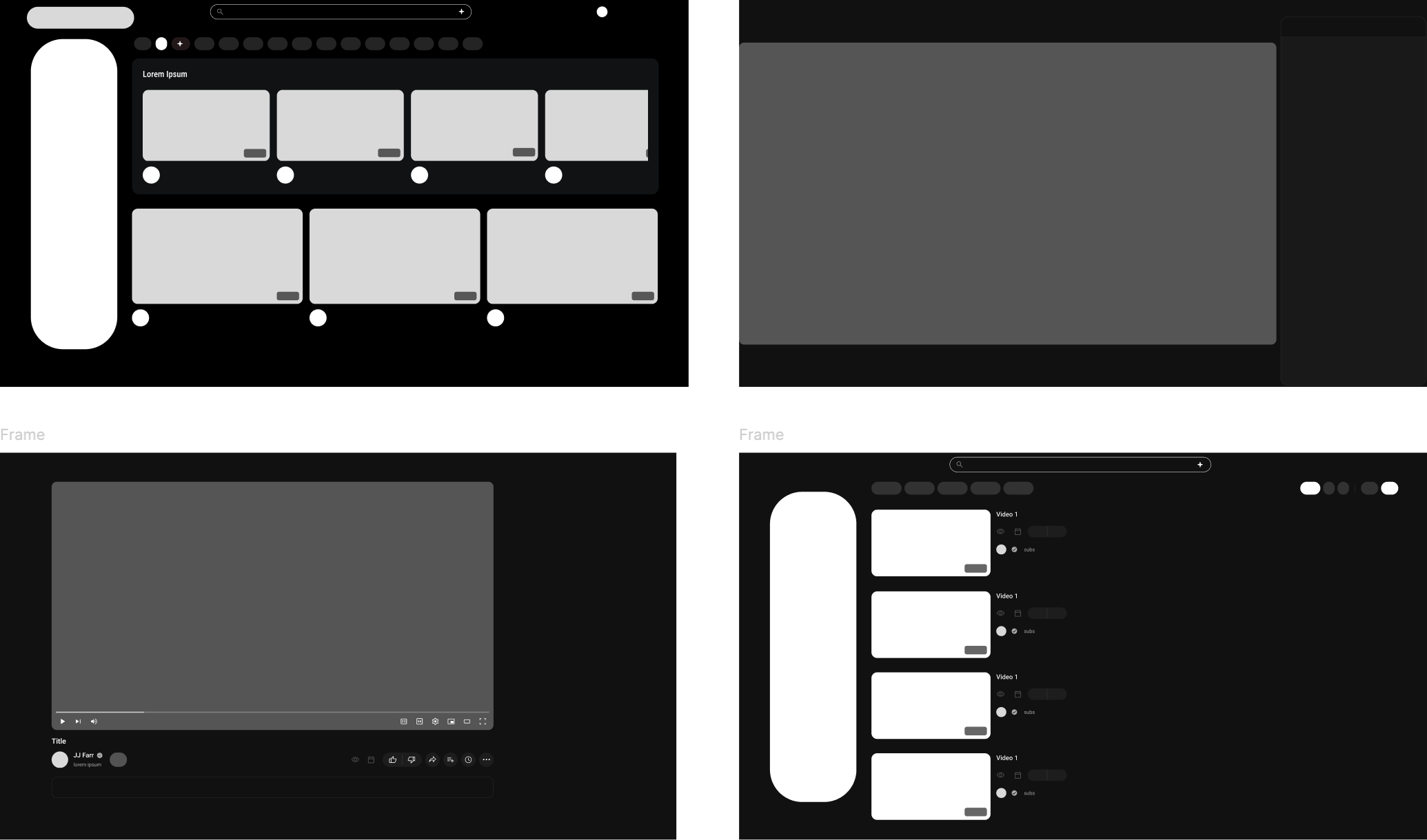
Core redesign elements
A Simplified and Streamlined Navigation System:
Enhancing accessibility by restructuring menus and improving search functionality.
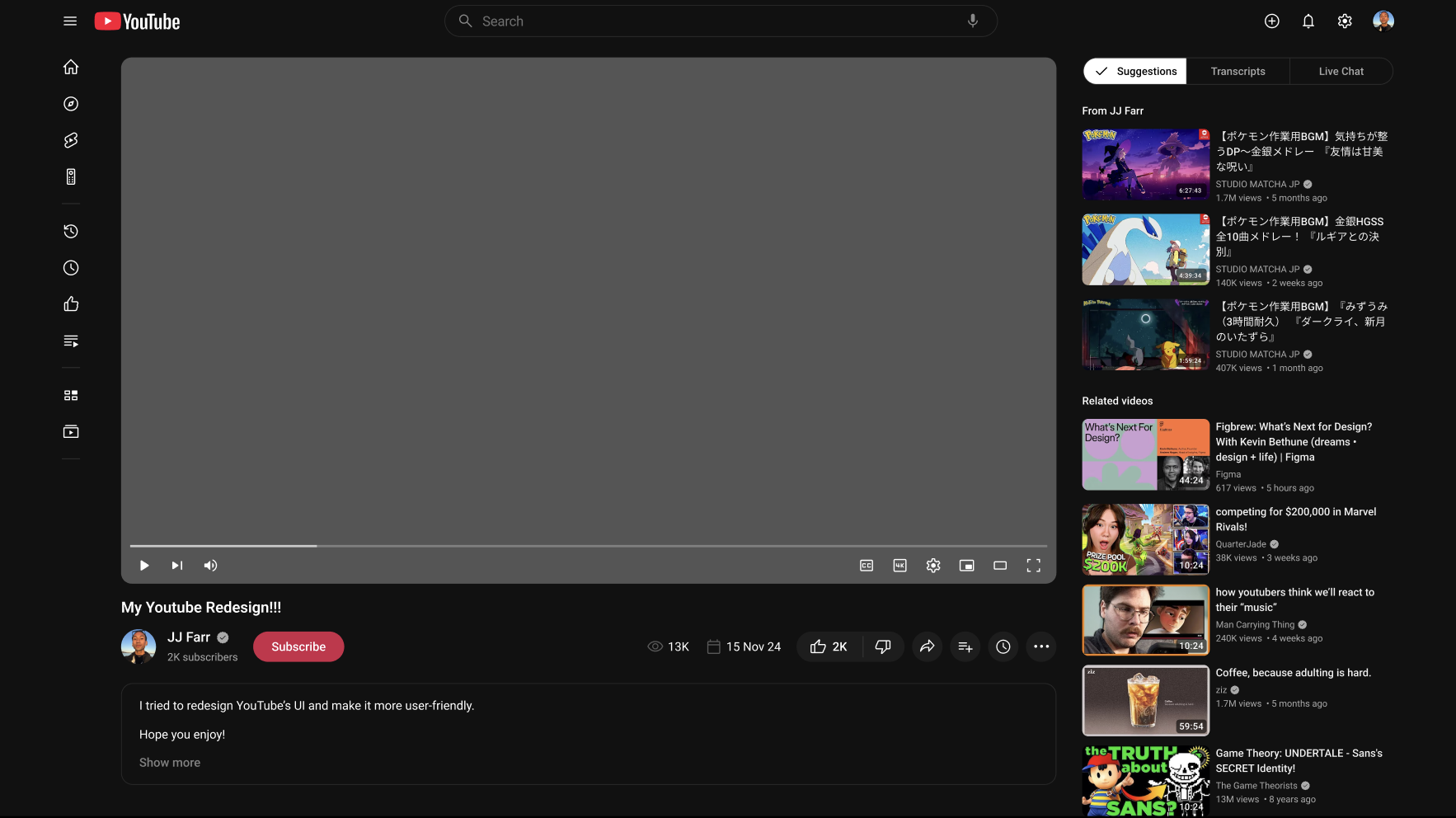
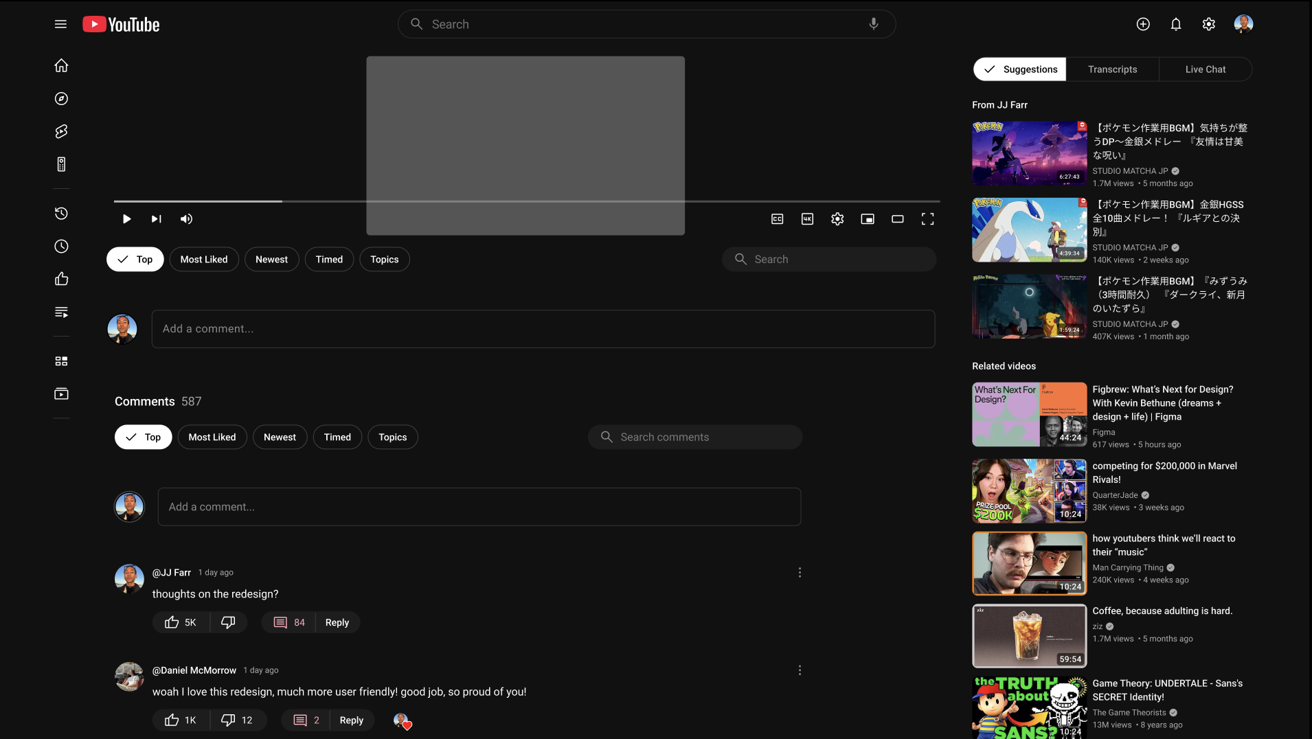
A Visually Refined UI:
Introducing a cleaner design with improved typography, spacing, and layout hierarchy.
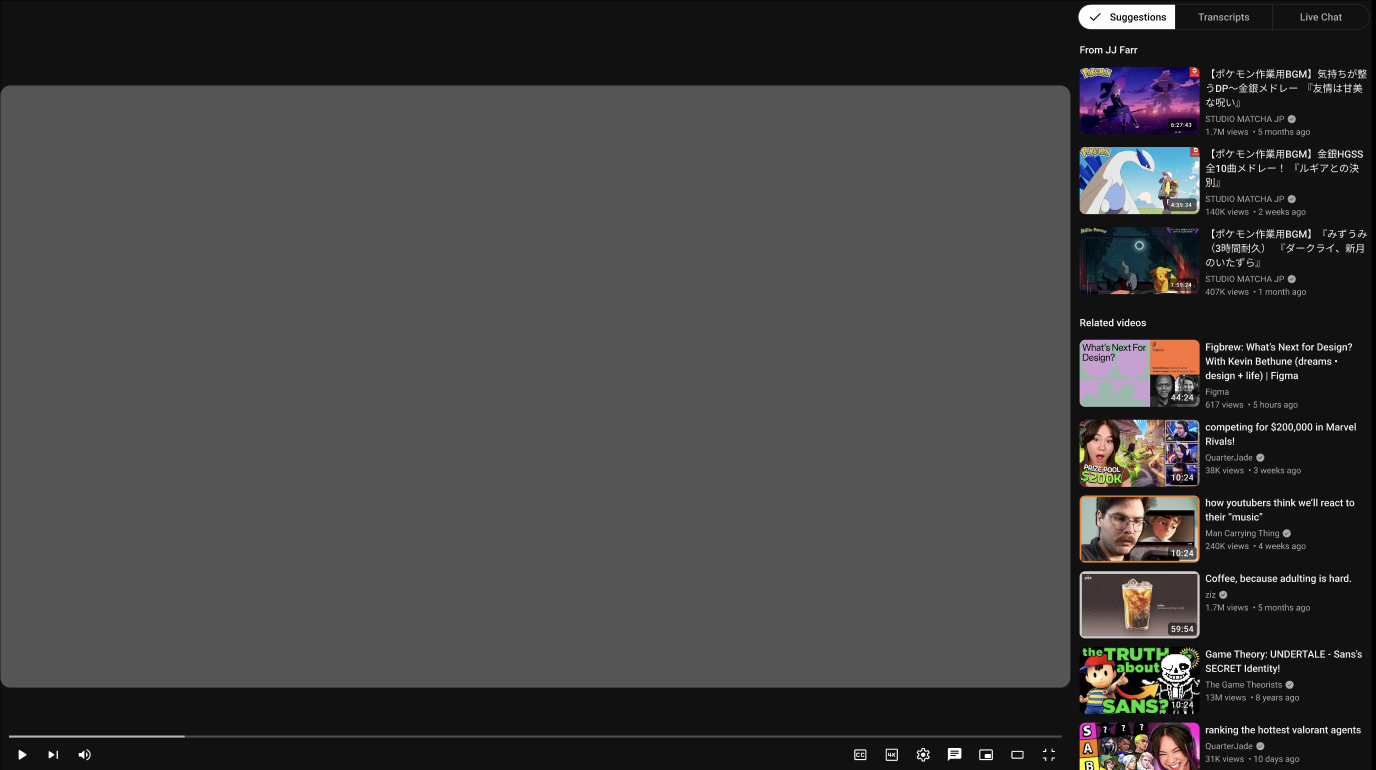
An Optimized Video Player Interface:
Providing clearer playback controls, real-time hover previews, accessibility features, and better multitasking features.
Personalized and AI-Driven Recommendations:
Improving content discovery by leveraging advanced algorithms to display relevant videos.
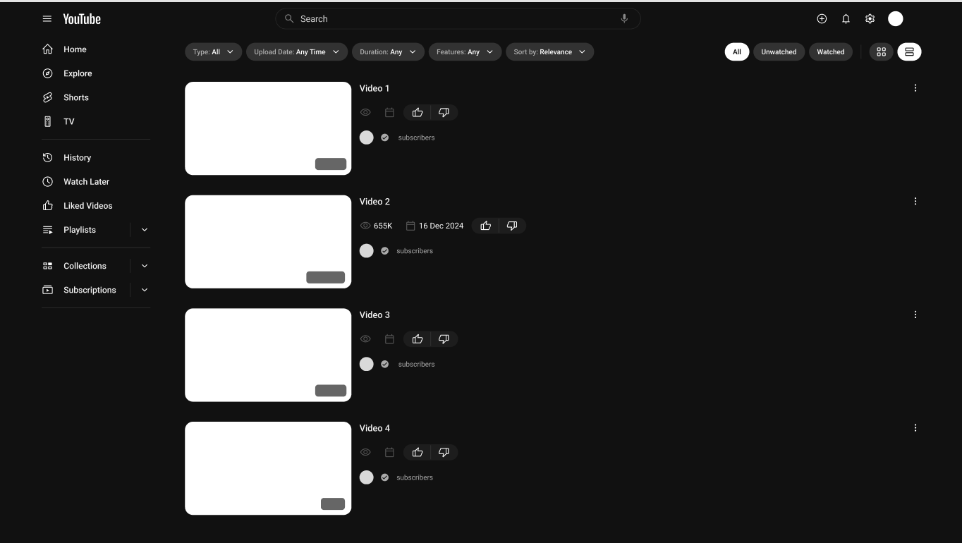
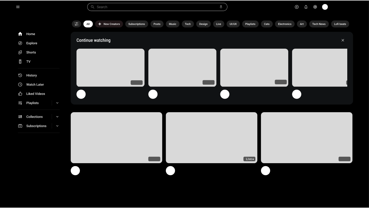
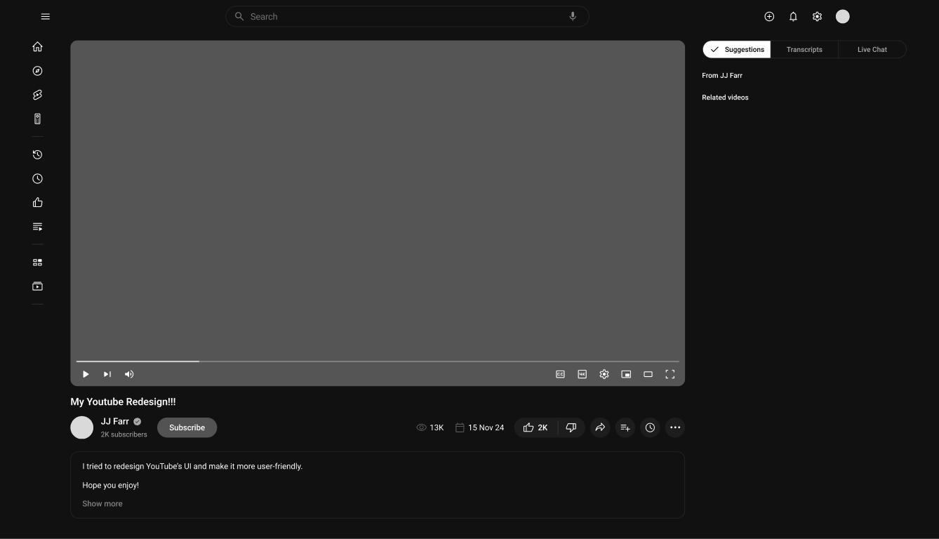
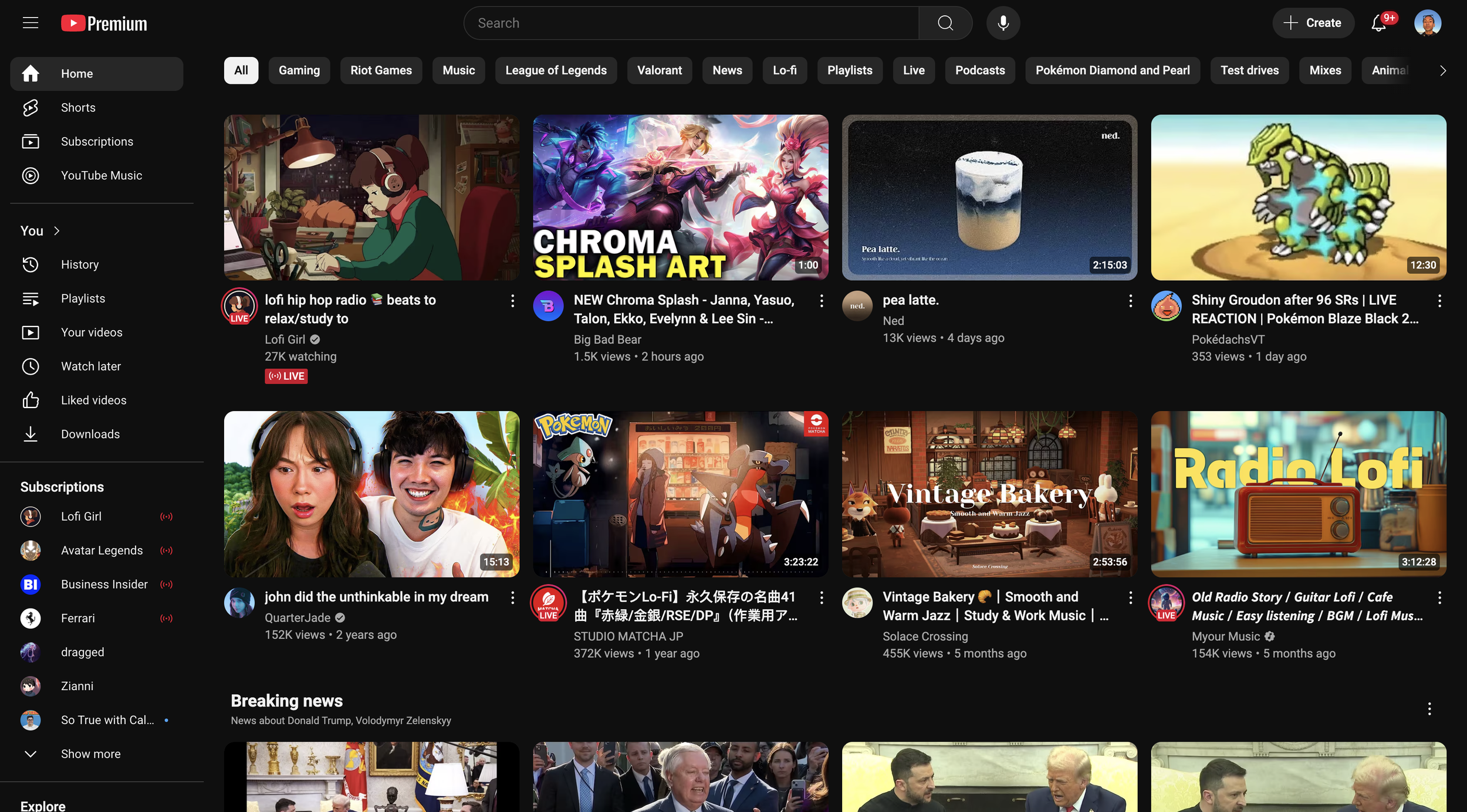
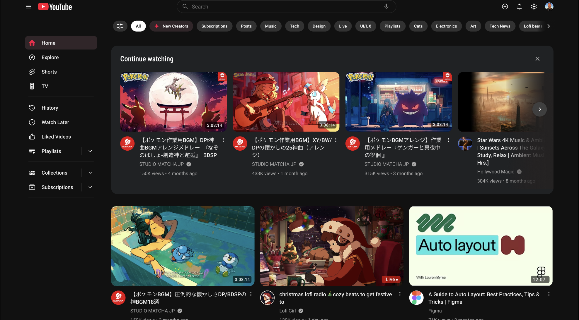
Final UI
Conclusion & Reflections
This redesign showcases how a thoughtful rework of user interfaces can improve clarity, reduce cognitive load, and support both novice and experienced users. The concept prioritizes usability and coherence, demonstrating a strategic approach to large-scale redesign problems.
Balancing Simplicity & Functionality: Removing excess UI elements while maintaining essential features resulted in a more intuitive experience.
The Role of Accessibility: Even minor adjustments in contrast and typography had a substantial impact on usability for visually impaired users.
Iterative Design is Key: Regular testing and iterations helped refine the redesign and align it with user expectations.
Personalization Enhances User Engagement: AI-driven recommendations and a customizable interface significantly increased user satisfaction.
User Feedback is Crucial: Direct input from different user groups ensured the final design addressed real-world usability concerns.